
Skip to content
Calendar ComponentPlayvox IsotypeMedia Player ComponentsAlerts and Messages

Playvox Design System

Project
Digital product
Client / Agency
Playvox / Pannonica
Year
2018 - 2021
Role
Product - UI - UX , Branding, Design System

Leveling up a successful digital product to compete with bigger players

Playvox is a workforce engagement platform for customer support teams. By the time I joined as a design consultant, it already had real users and a growing business, but it had grown without a design team or a system to hold its interface together. I worked on the creation of the system that gave the product the consistency and scalability it needed to take that next step.
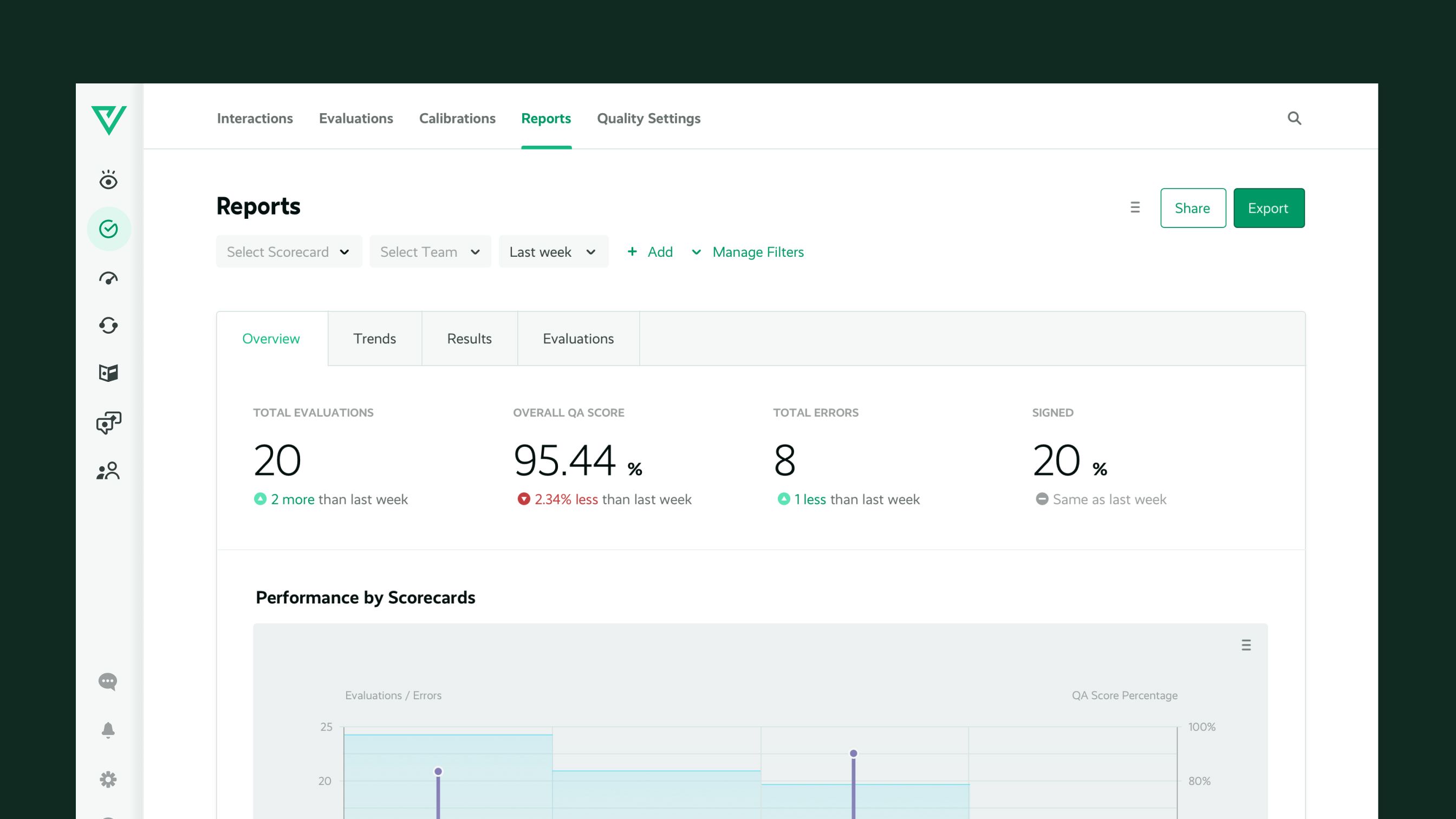
A Reports dashboard screen from before the redesign, with scorecard filters, summary metrics and a performance chart, in a dark green interface.
An early UI exploration, testing how the new visual foundation would sit on a real screen.

Rebuilding the visual foundation. The product's visual identity, from the logo to its colors, hadn't kept pace with the business. Before any interface work could start, Playvox needed a visual foundation solid enough to build a design system on.

The Playvox logo redrawn on a diagonal grid, showing the geometric construction behind its green "V" mark.

Screen with no system behind. Patterns behaved differently from one screen to the next, and the interface felt inconsistent wherever you looked. The product had grown screen by screen, with no shared components, type scale or color logic to build on. The challenge was to turn that into a design system that could carry the whole product, consistently and at scale.
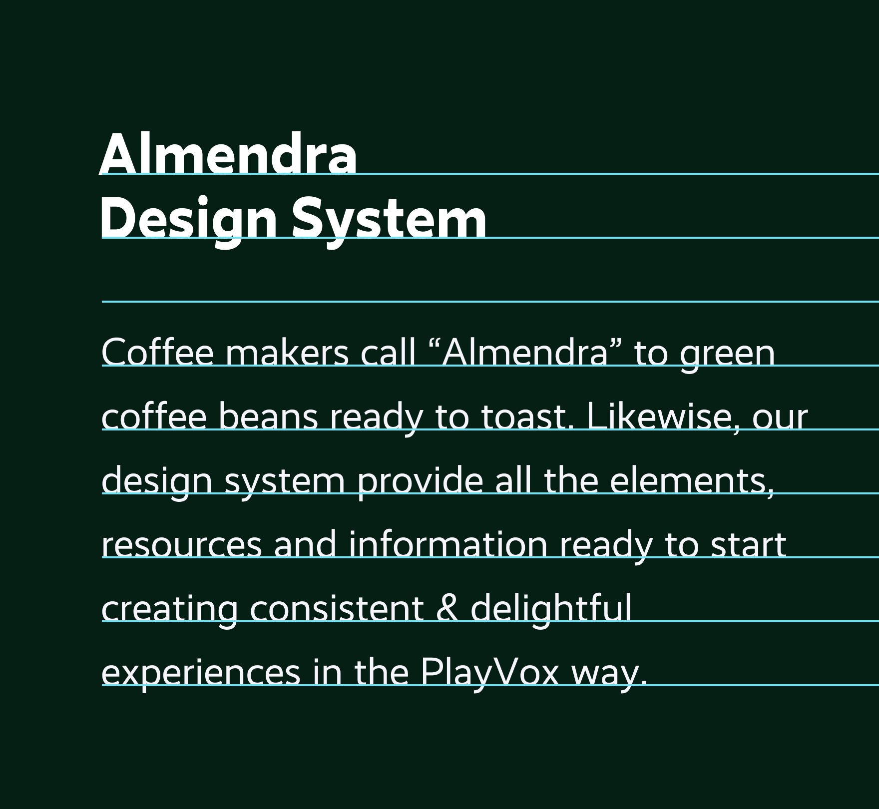
A dark green panel from the Almendra Design System showing type specifications, including a baseline grid, with sample text set on the grid.

A company with no design maturity. The only design work being done was closer to marketing than product, with no say over decisions and no design process built into the team's workflow. Raising Playvox's design maturity, not just its interface, was as much the goal as the system itself. In our first explorations, we tried to find a language that felt professional but also relatable to Playvox's team, keeping the illustration style and giving it more relevance.
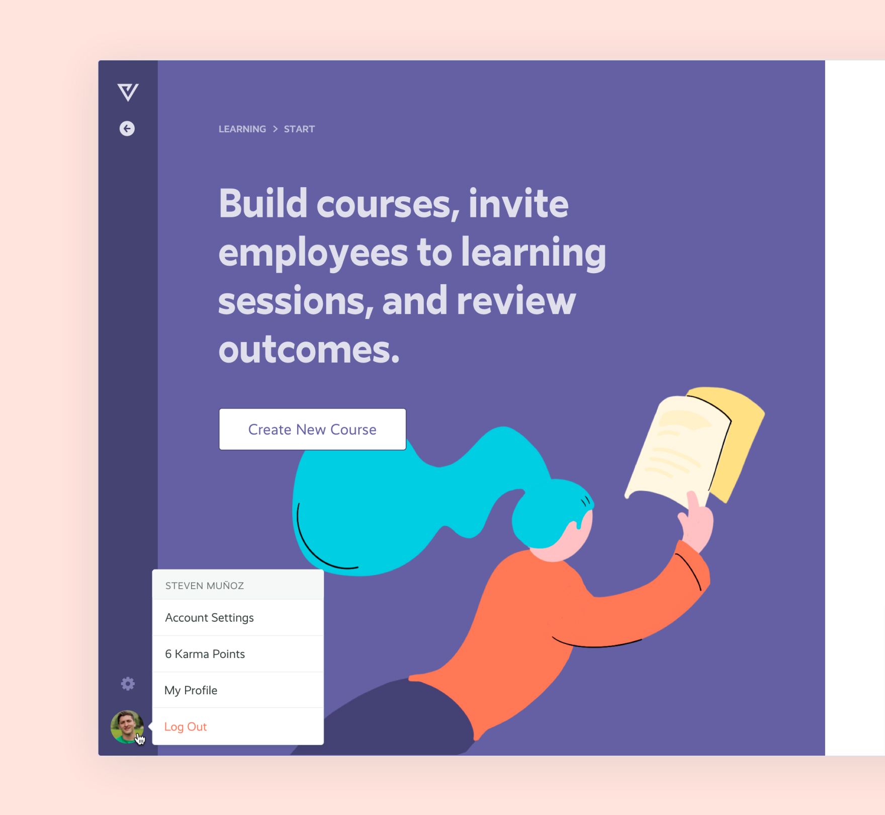
A course-builder screen with an illustration of a person reaching for a book, next to a "Create New Course" button and a user account menu.

From foundation to component

Leveling up Playvox meant building from the ground up: a visual foundation solid enough to design on, a system that could carry the whole product consistently, and the components that made that system usable day to day.
The new Playvox wordmark and symbol in green, on a dark background.
A new logotype: we kept the original concept, but improved the typography and the construction of the symbol for a more professional, better balanced brand.
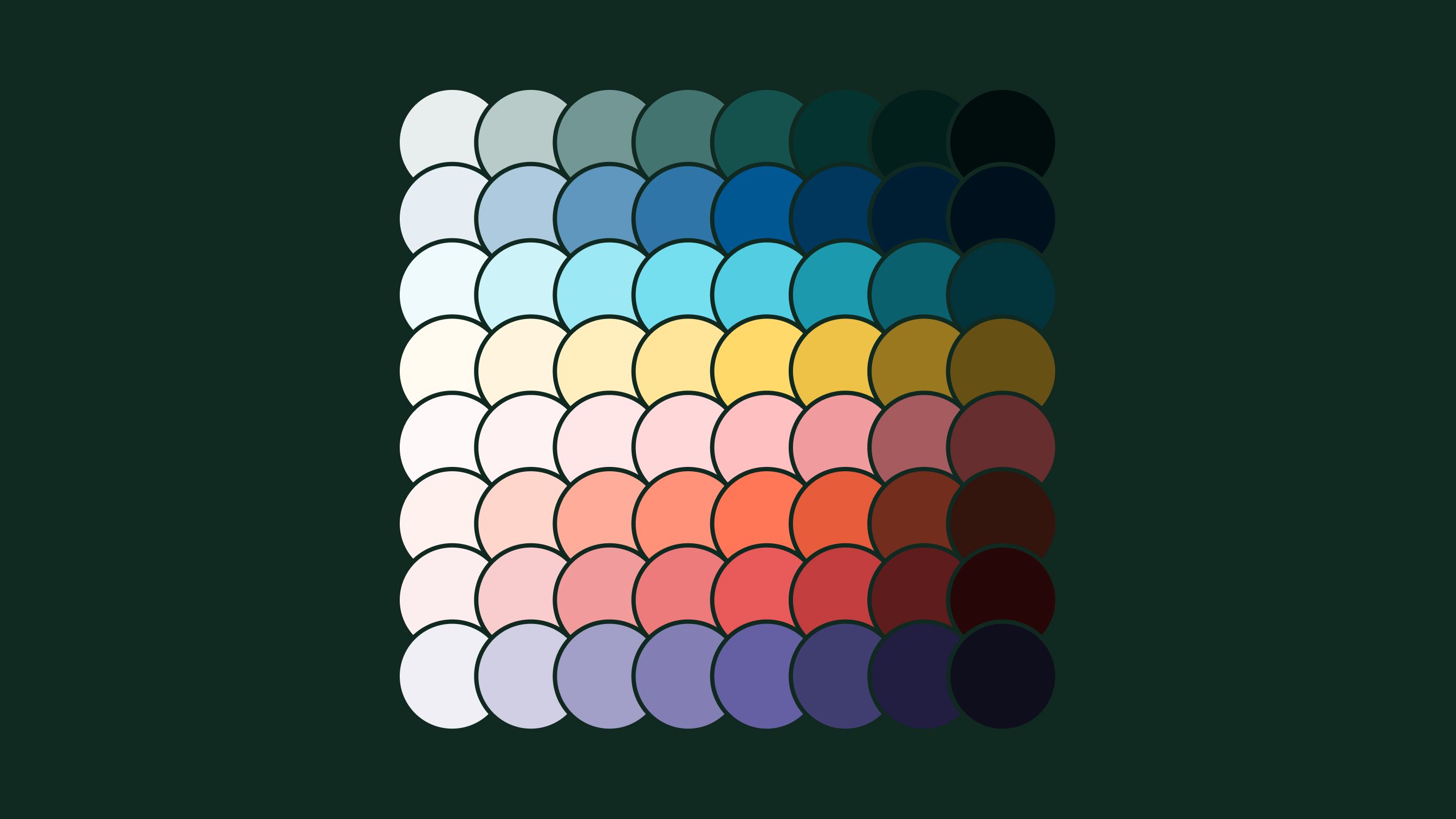
A grid of overlapping colored circles on a dark green background, showing the secondary color palette built to complement the main brand green.
New secondary color palette to complement the main green.
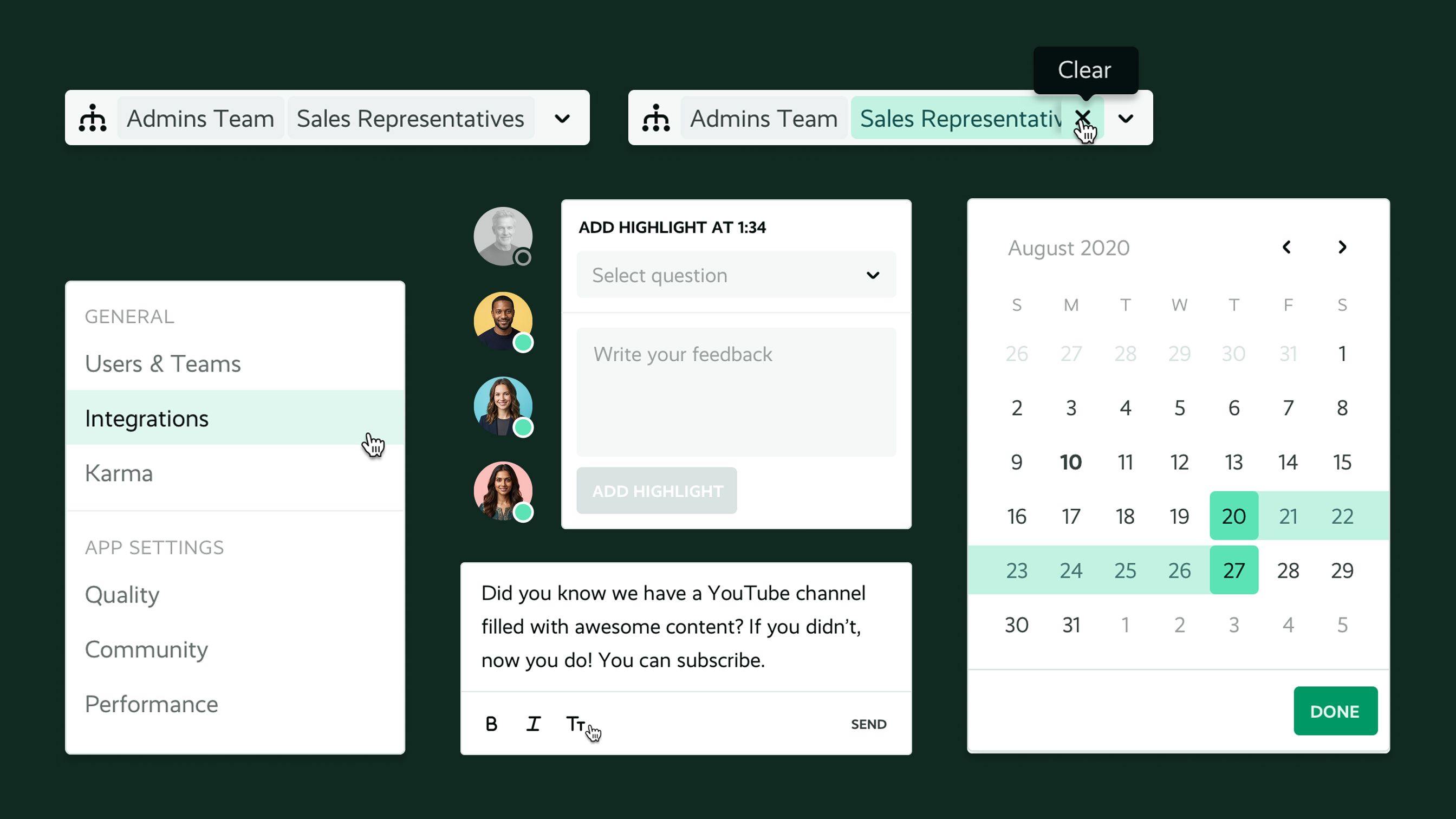
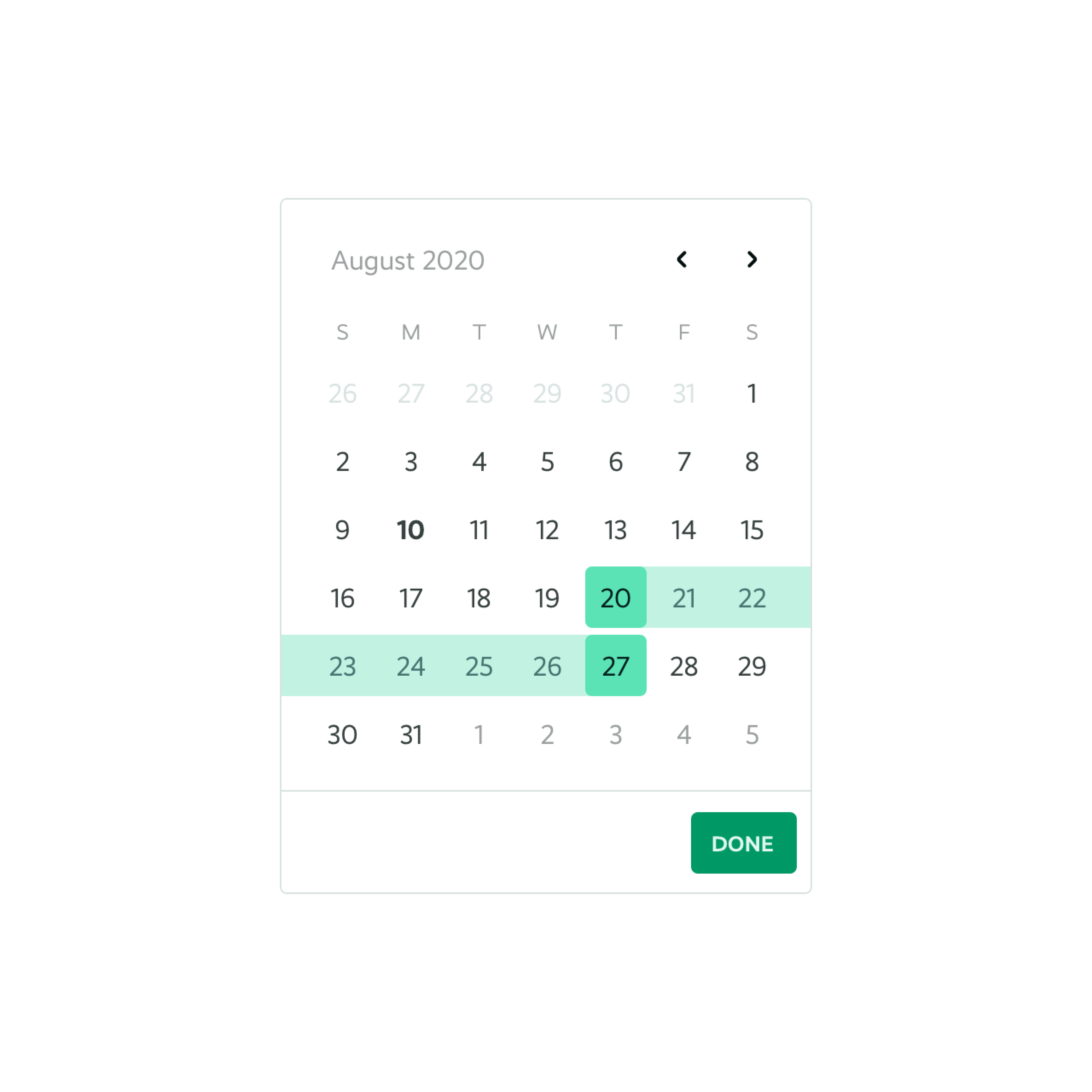
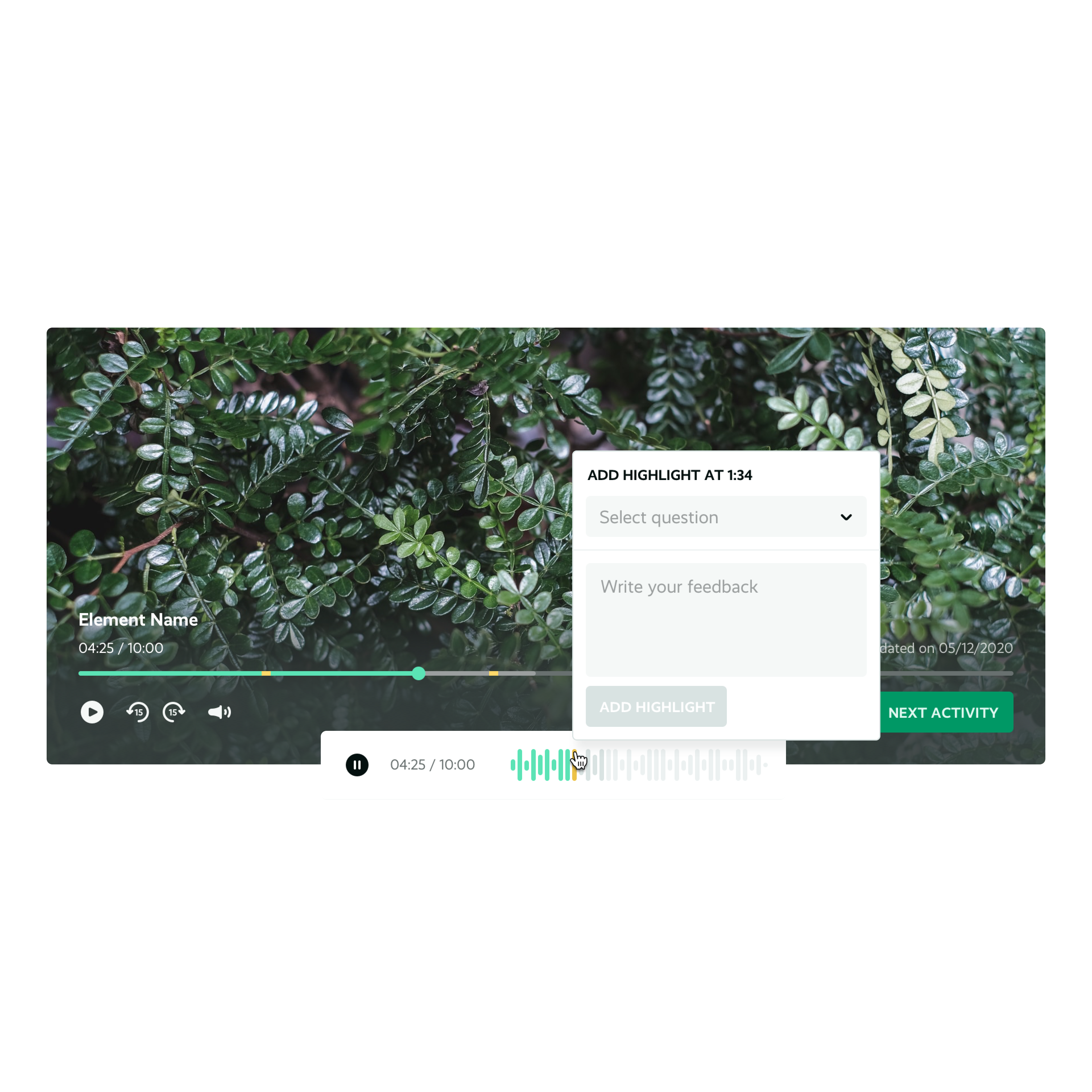
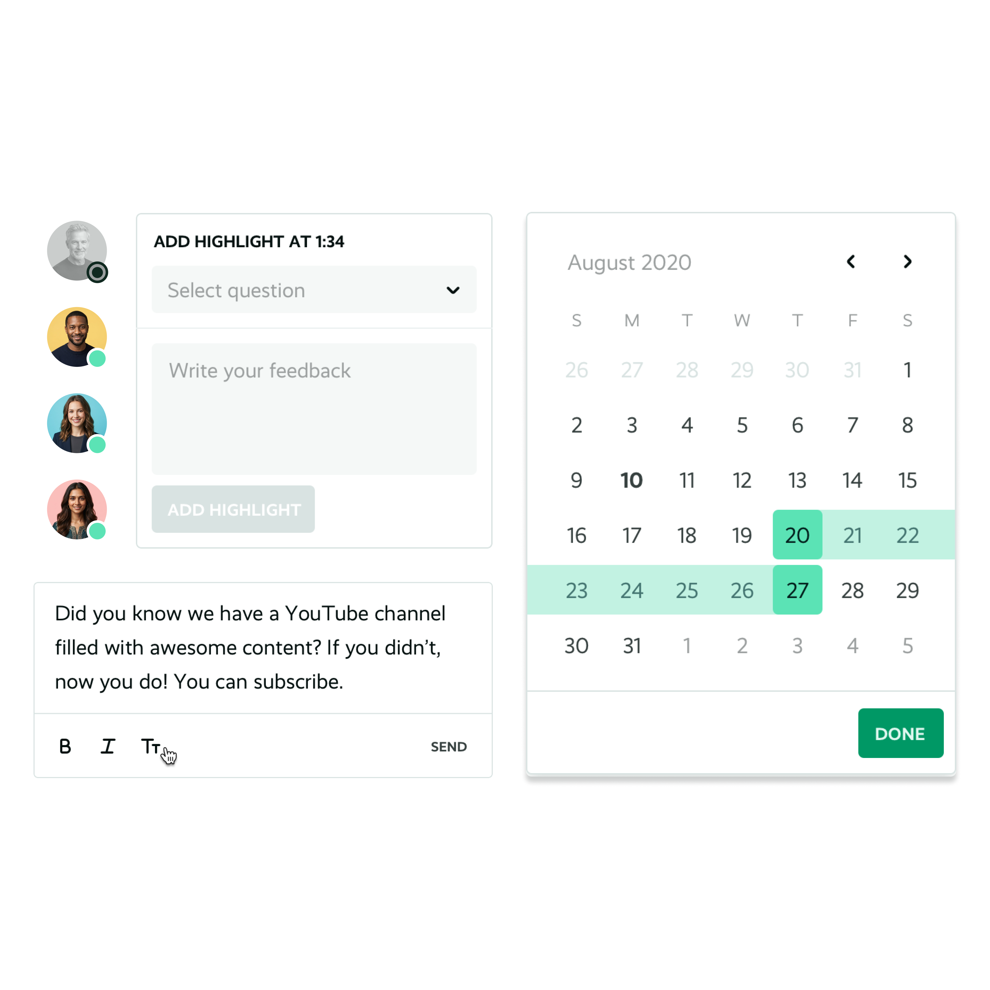
UI components on a dark background: team and date filters, a highlight panel with a comment field, and a calendar picker.
Dropdowns, filters, text areas and more.
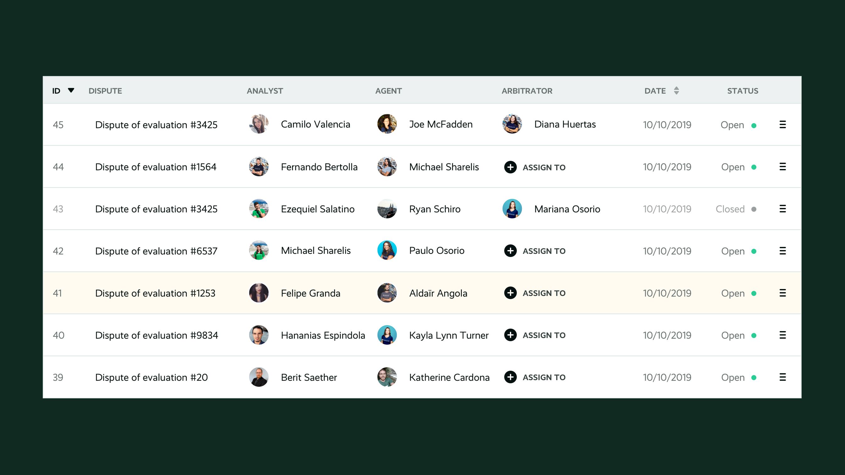
A dark table component listing evaluation disputes, with columns for analyst, agent, arbitrator, date and status.
Table components
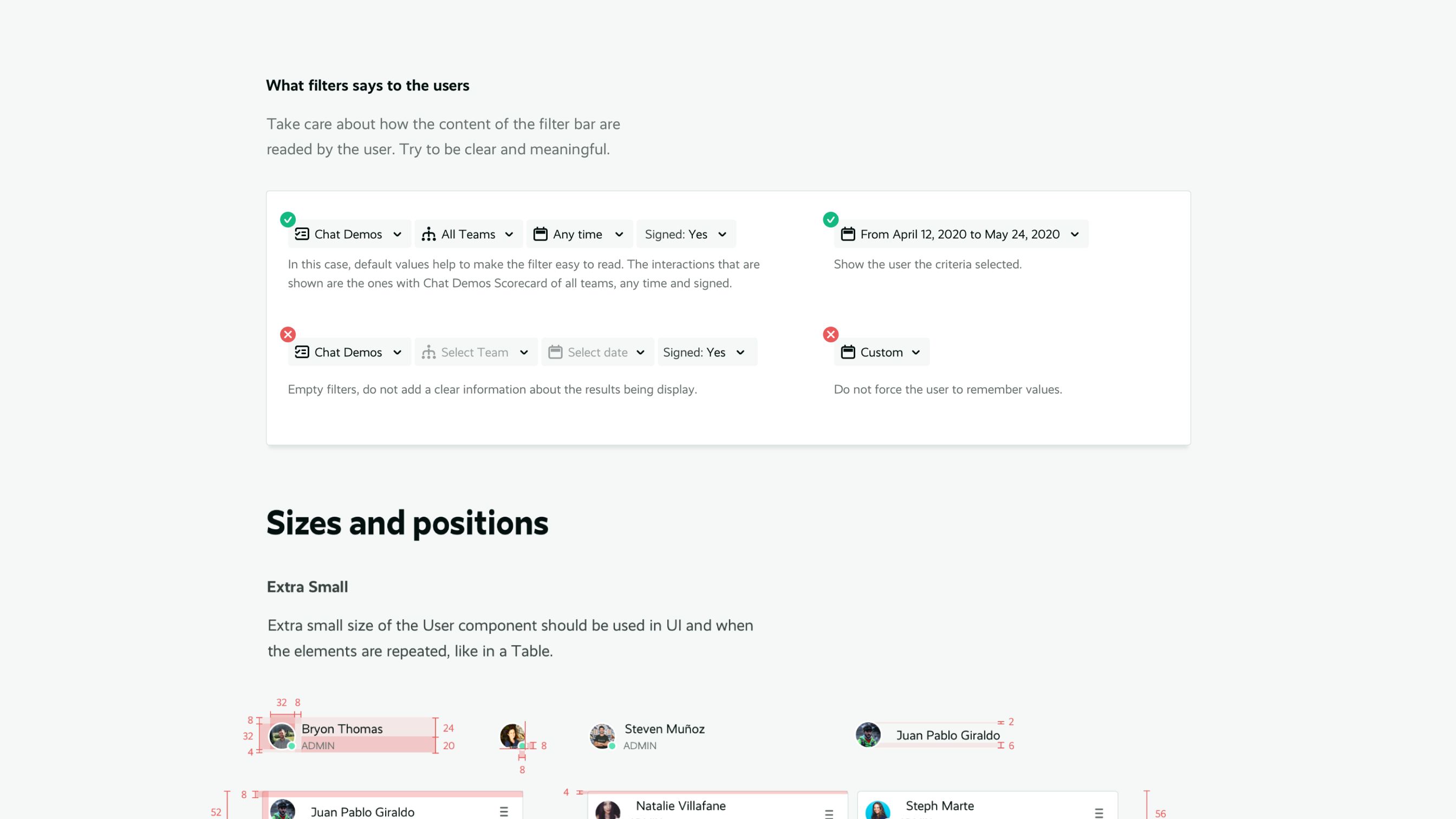
Documentation showing correct and incorrect filter bar examples, followed by sizing and spacing specifications for a user component in different sizes.
Documentation does not only include the components, but also usage instructions and measures.
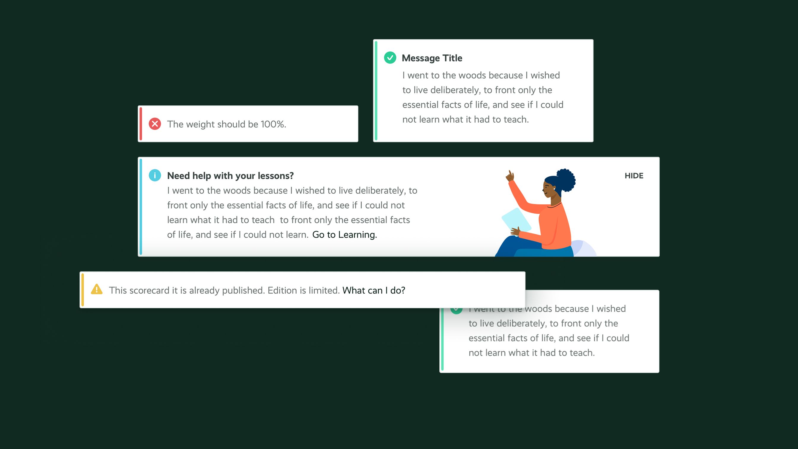
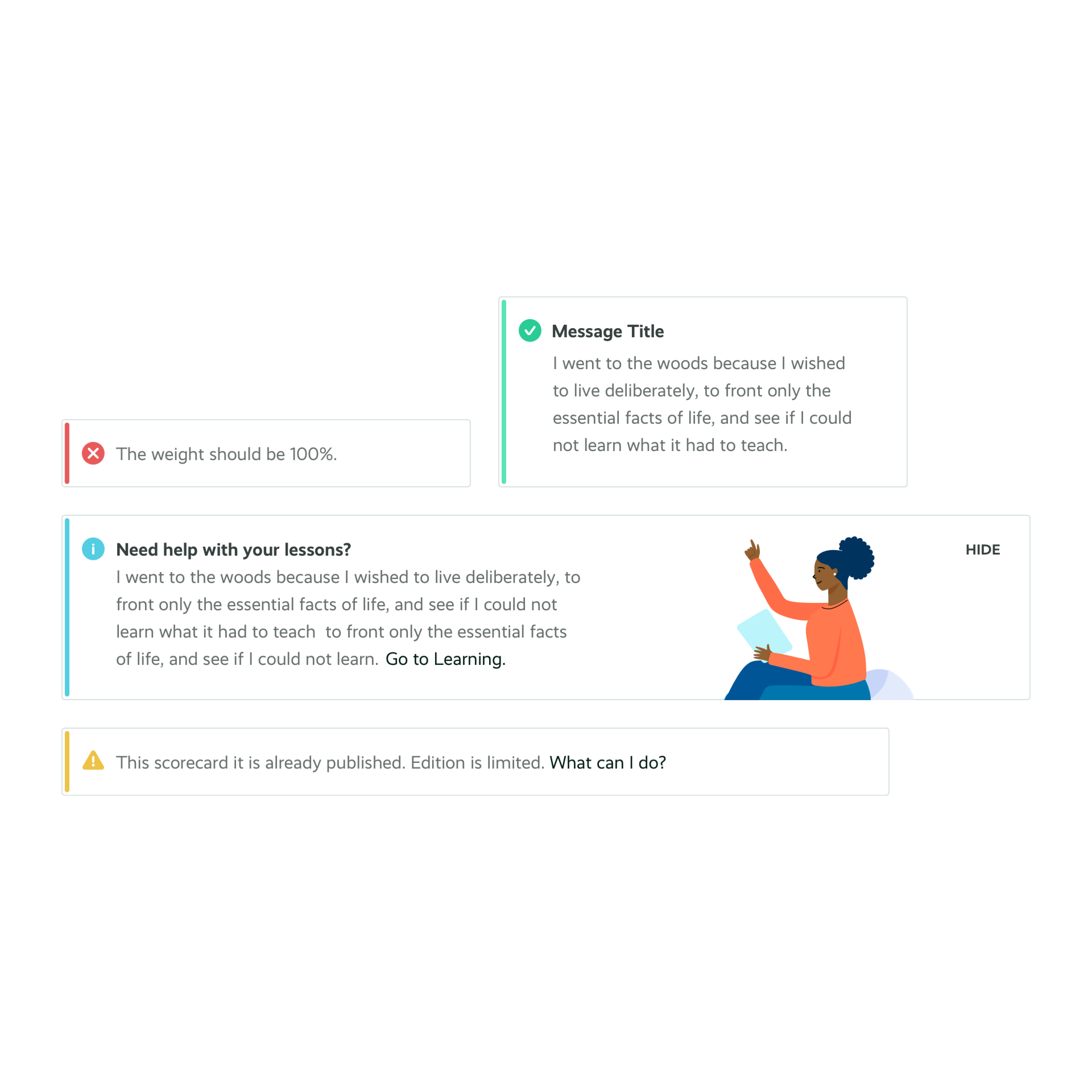
Message and alert components in different states, success, error, info and warning, each with an icon and sample text, on a dark background.
Messages and alerts
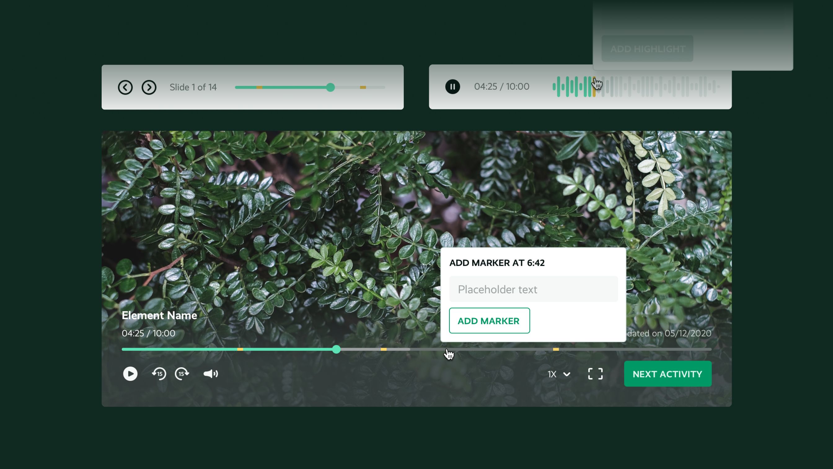
A video player component over a nature background, with playback controls, a timeline with markers, and a panel to add a marker at a specific time.
Media players for videos and text courses to train users.

Design, built to stay

By the end of the consultancy, Playvox had a design system in place, aligned with the code. But most important was a real design team: the company had gone from one designer working closer to marketing than product, to a full UX team and a design director, with design processes built into how the company worked. Playvox was later acquired by NICE, and today operates as Playvox by NICE inside the NICE CXone platform.
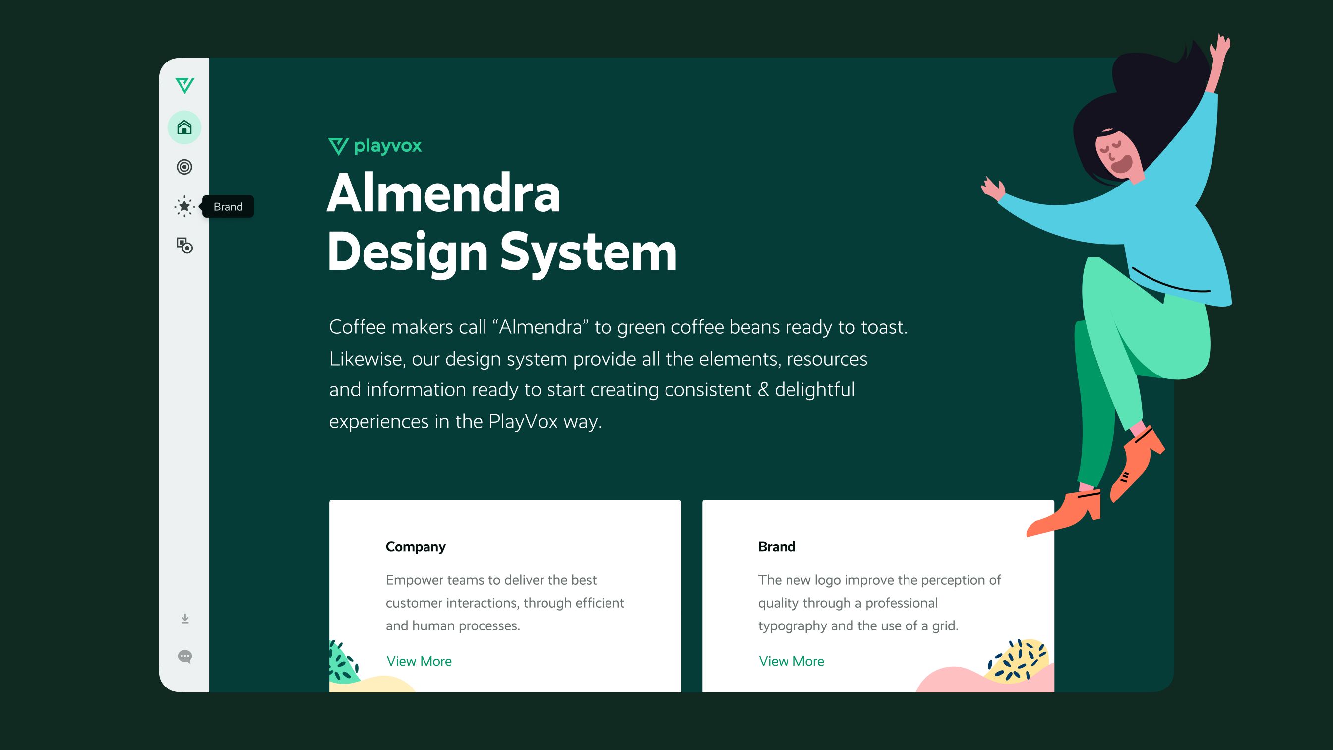
The cover page of the Almendra Design System website, with an illustration of a person jumping and two cards linking to Company and Brand sections.
Early Almendra Design System cover page. To gain adoption and visibility inside the company, we created a website for the design system. 'Almendra' was the name chosen by the internal team due to their Colombian roots and knowledge of coffee culture.

The Team

Playvox: Client / Development / Illustrations / UI - UX.

Pannonica: UX Consultancy Agency, Content Design.

Ezequiel Salatino: Design System / Product - UI - UX Design / Branding / Design Consultancy.