Skip to content
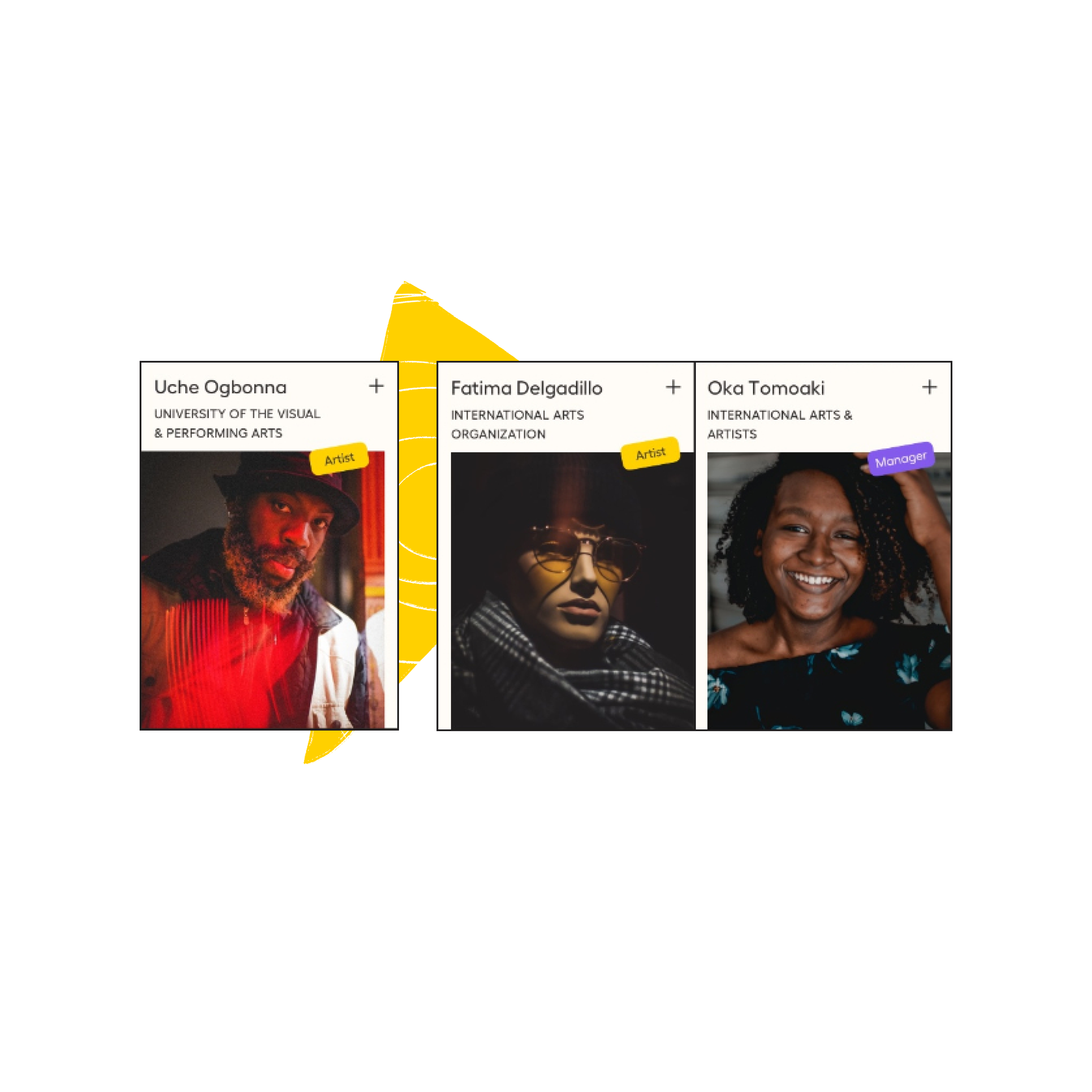
Three abstract shapes overlapping: a blue textured triangle, an orange octagon with a wave pattern, and a yellow triangle with a spiral, on a dark background.A network graph with six named circles, Veraldi Jeanne, Lizzie Rose, Yiung Cho and Kari Granleese, plus a hexagon for Cáritas, all connected to a central node, Alexander Stefan.Two dark cards side by side, "Social Business Plan" with tags like Finance and Leaders, and "A Matchmaker of volunteering" describing a TED Fellow art project, set against orange and blue organic shapes.A tilted sheet of grid paper in cream and blue, resting over a blue cloud-like shape, on a dark background.Three member cards, Uche Ogbonna, Fatima Delgadillo and Oka Tomoaki, each with a role tag and a portrait, over a yellow organic shape.

Community Arts Network

Project
Website / Interactive Network
Client / Agency
CAN / Domestic Data Streamers
Year
2024
Role
Web Design, Data Visualization, UI - UX

A map and a home for artists who want change.

The Community Arts Network (CAN) is a global platform of over 1,000 members in 80 countries who use the arts for social change. I designed the website that turns a community of ideas into a network, and a network into a force for change.
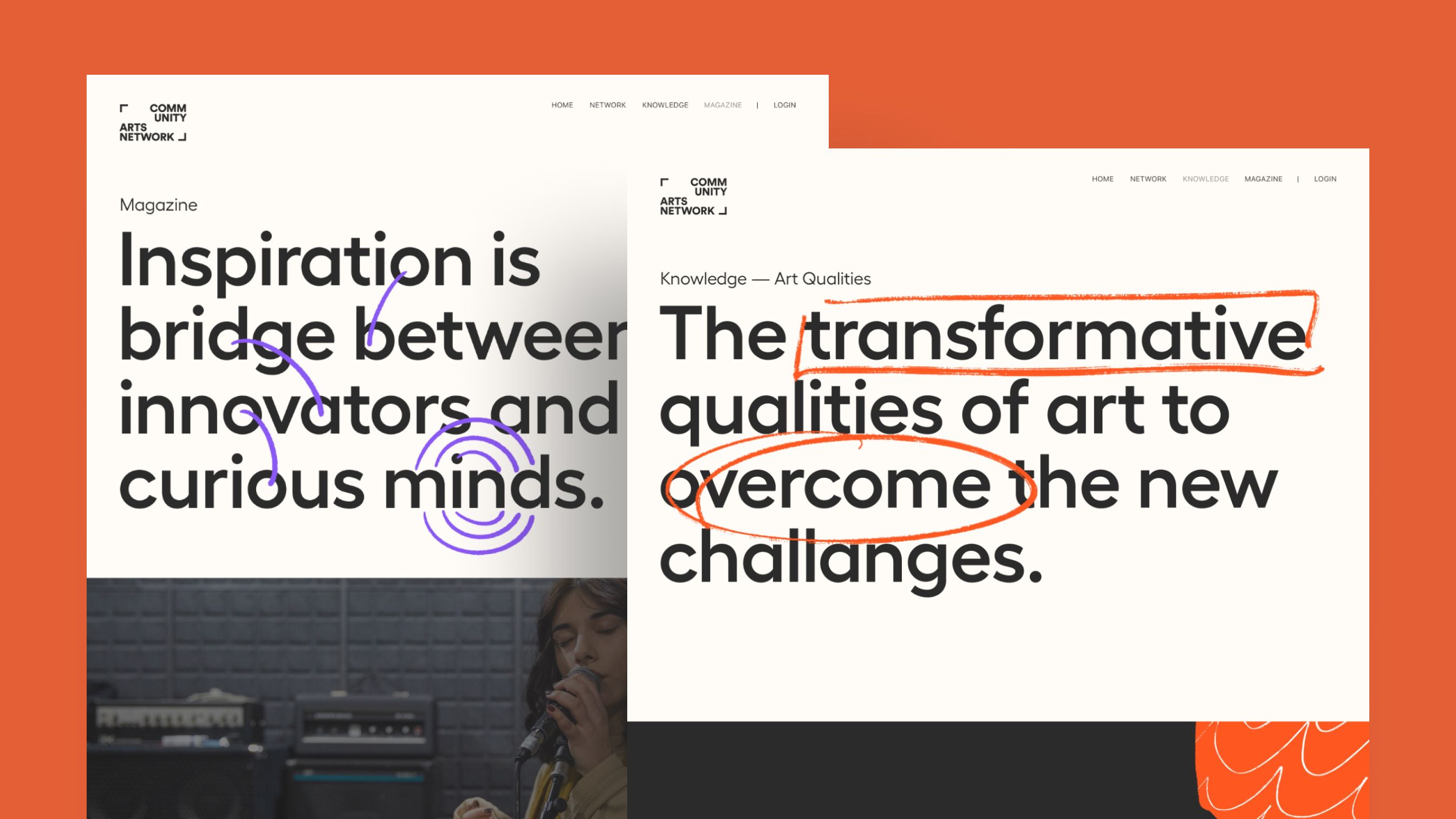
Two Community Arts Network screens with hand-drawn marks: a purple swirl under "Inspiration is a bridge between innovators and curious minds", and an orange underline and circle on "The transformative qualities of art to overcome the new challenges".
Swirls and underlines turn headlines into statements.
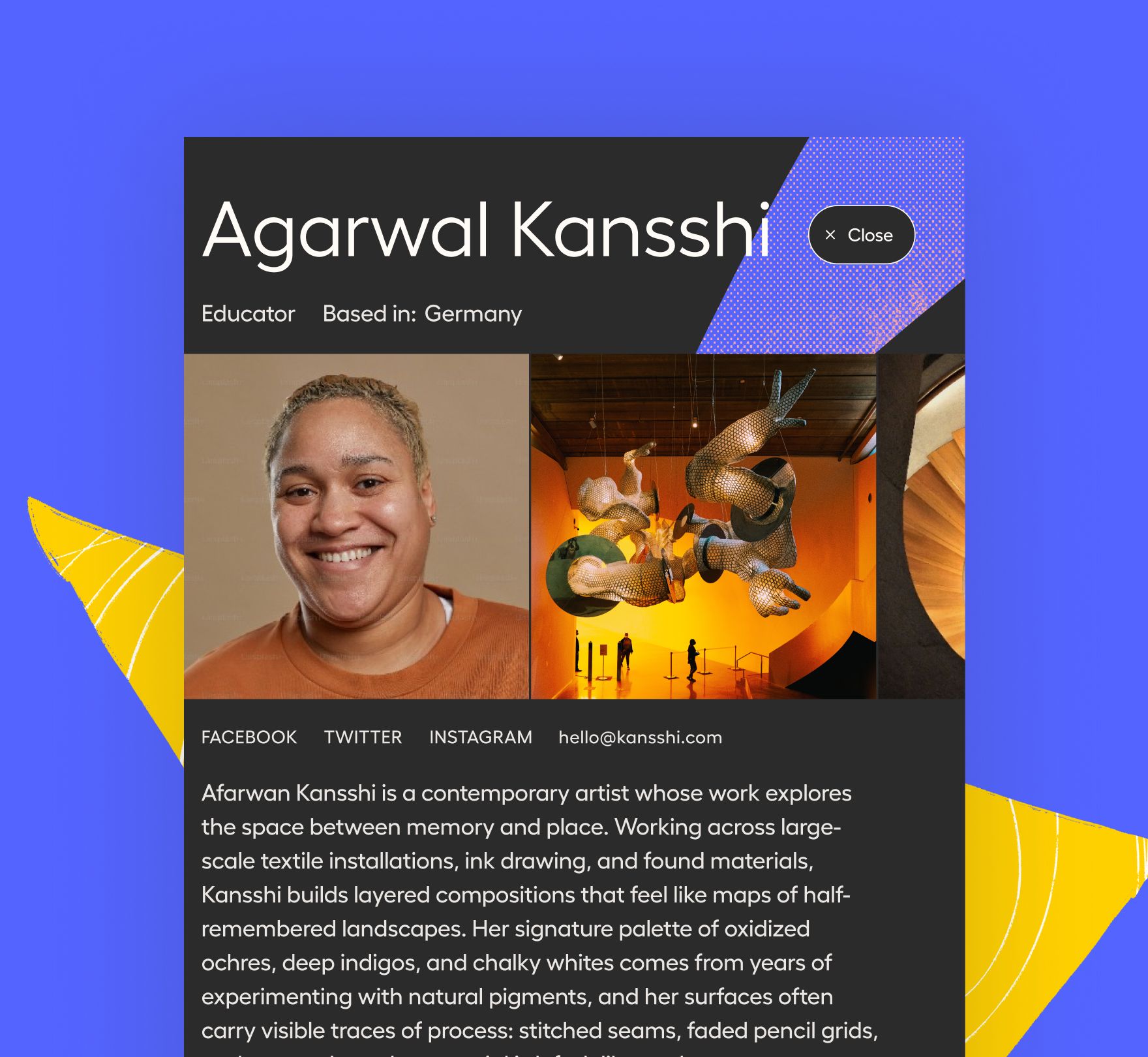
A member profile card for Agarwal Kansshi, an educator based in Germany, with a portrait, a photo of an art installation, social links and a short bio.

Visualizing a complex network. The community is made of individuals and organisations across more than 80 countries, all linked to each other. The challenge was to turn that web into something visitors can explore and understand, and to help them discover connections they would not have found on their own.

Communicating art and social work at once. 

 CAN exists to use the arts for social change, so the site had to feel like both: the expressive energy of art and the purpose of social work. The challenge was to communicate that feeling through the design itself, not only through the content.
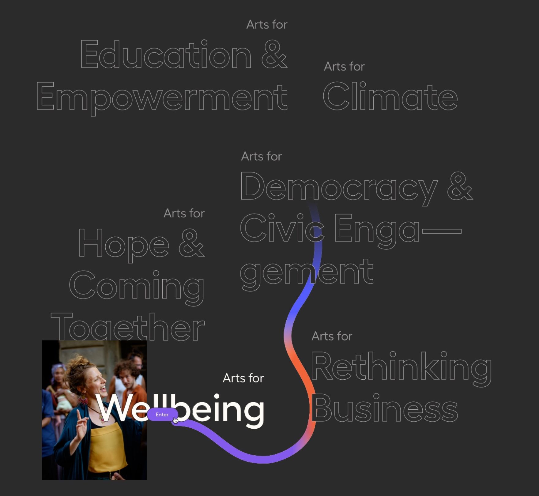
A dark screen listing the site's topics, "Arts for Education & Empowerment," "Climate," "Democracy & Civic Engagement," "Hope & Coming Together," "Rethinking Business," and "Wellbeing," connected by a winding line that shifts from yellow to purple to orange, with a photo and an "Enter" button on "Wellbeing."

Art that takes a stand

Communicating art and social work at once took two steps. First, I created a set of illustrations that bring color and energy across the site, also representing different voices through different shapes and techniques. Then we complemented them with big hero statements that feel like a social claim. Together they work as one voice, so art and social work feel like a single message, and they set the tone before anyone reads the content.
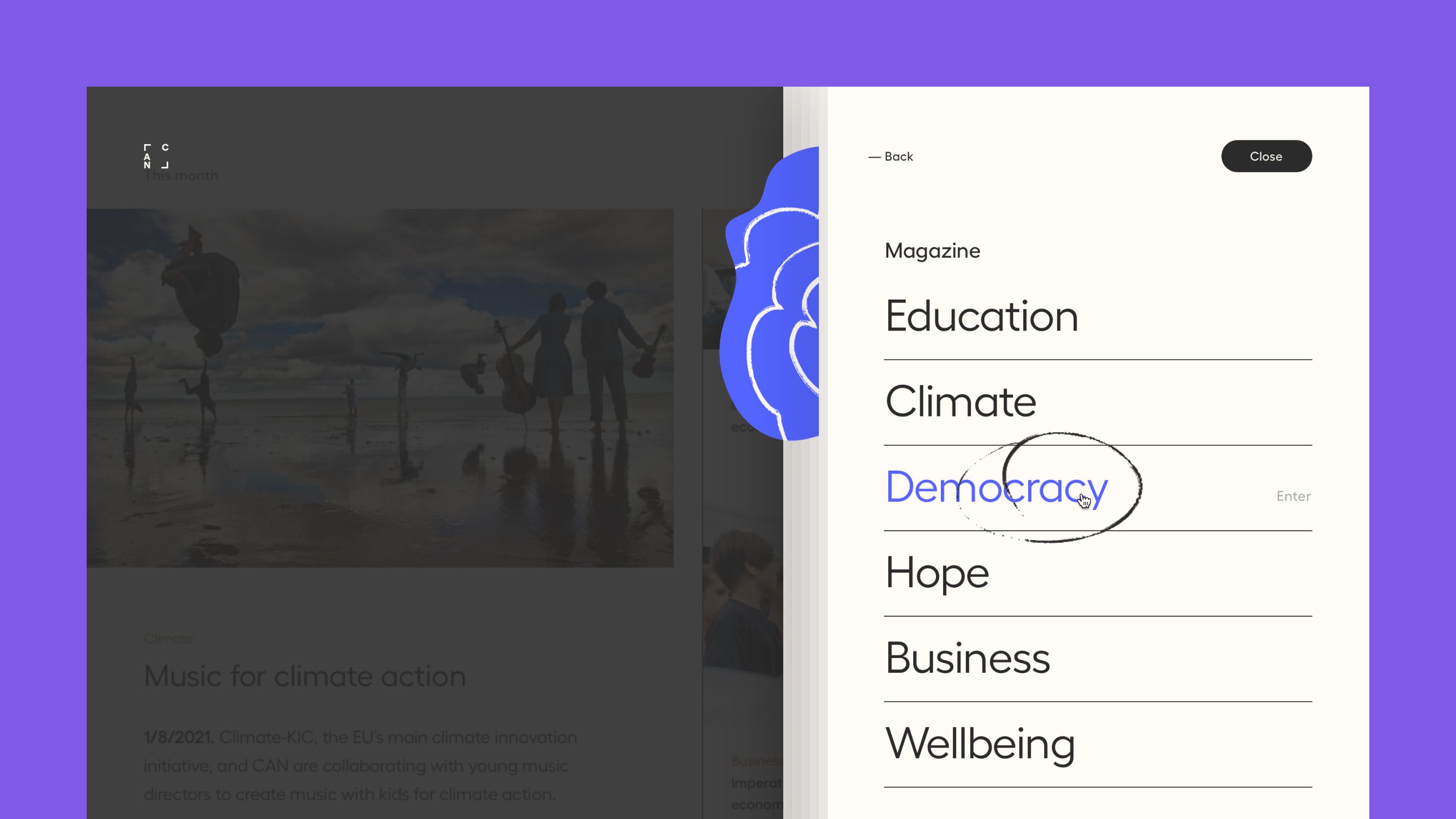
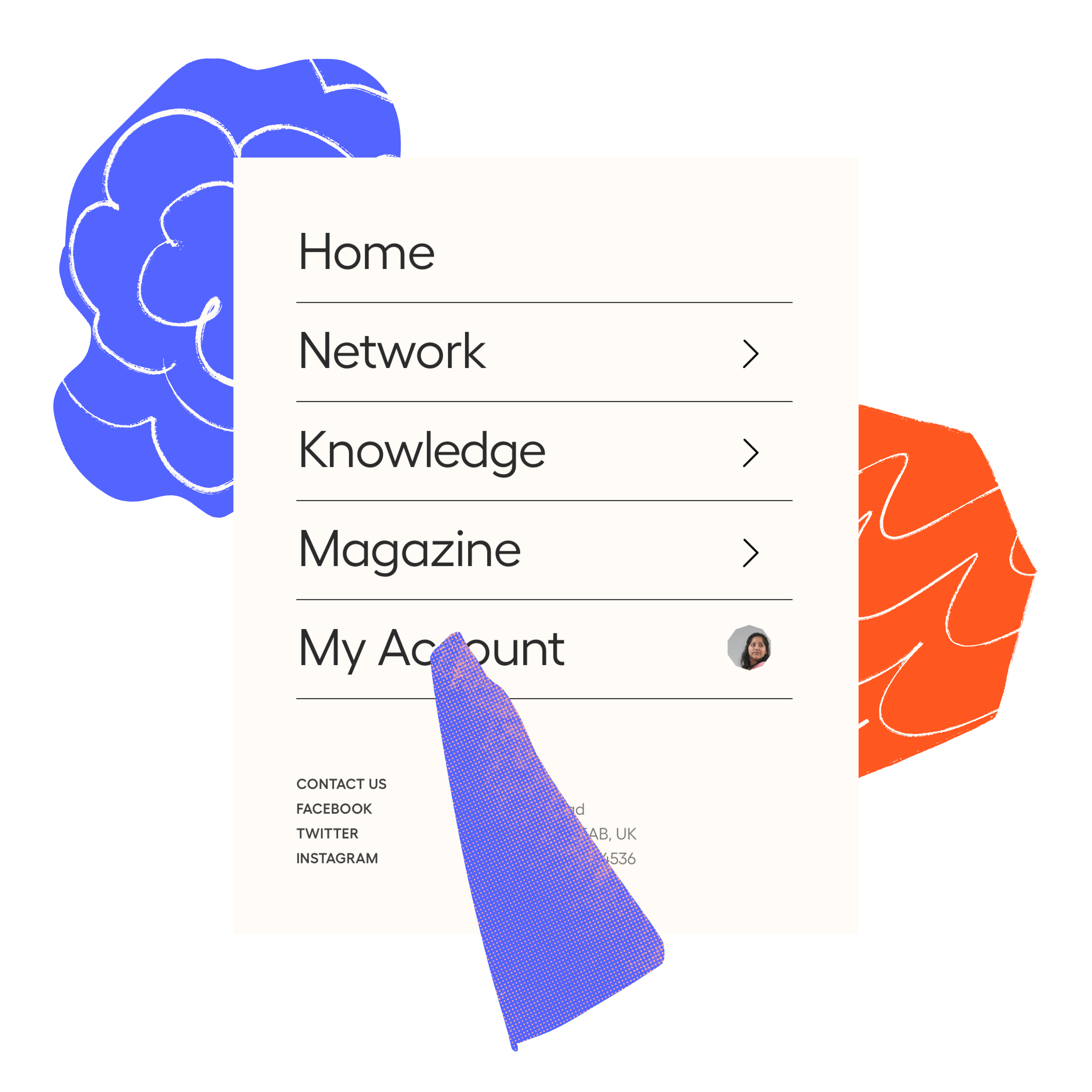
The Magazine menu open over a blog post, with a hand-drawn circle around the topic "Democracy" and a "— Back" and "Close" button.
Even the menu carries a mark, so choosing a topic feels like taking a stand.
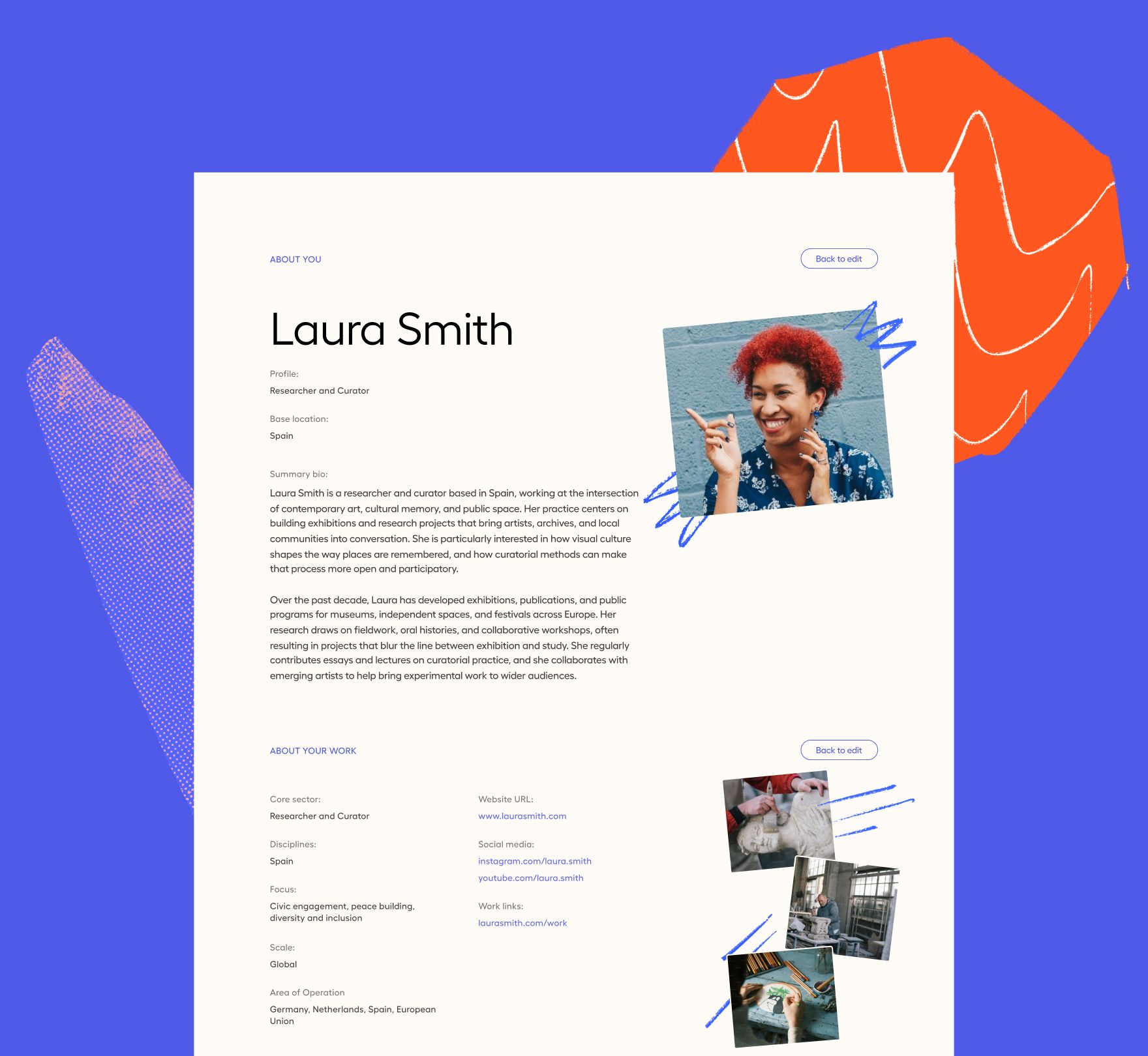
A registration form for a member profile named Laura Smith, researcher and curator based in Spain, with fields for bio, focus areas, links and photos, framed by an orange organic shape.

The illustrations don't stay inside a frame. Colorful shapes overflow the content and live beside it, each with its own shape and technique for a different voice, so every page feels composed, not templated.
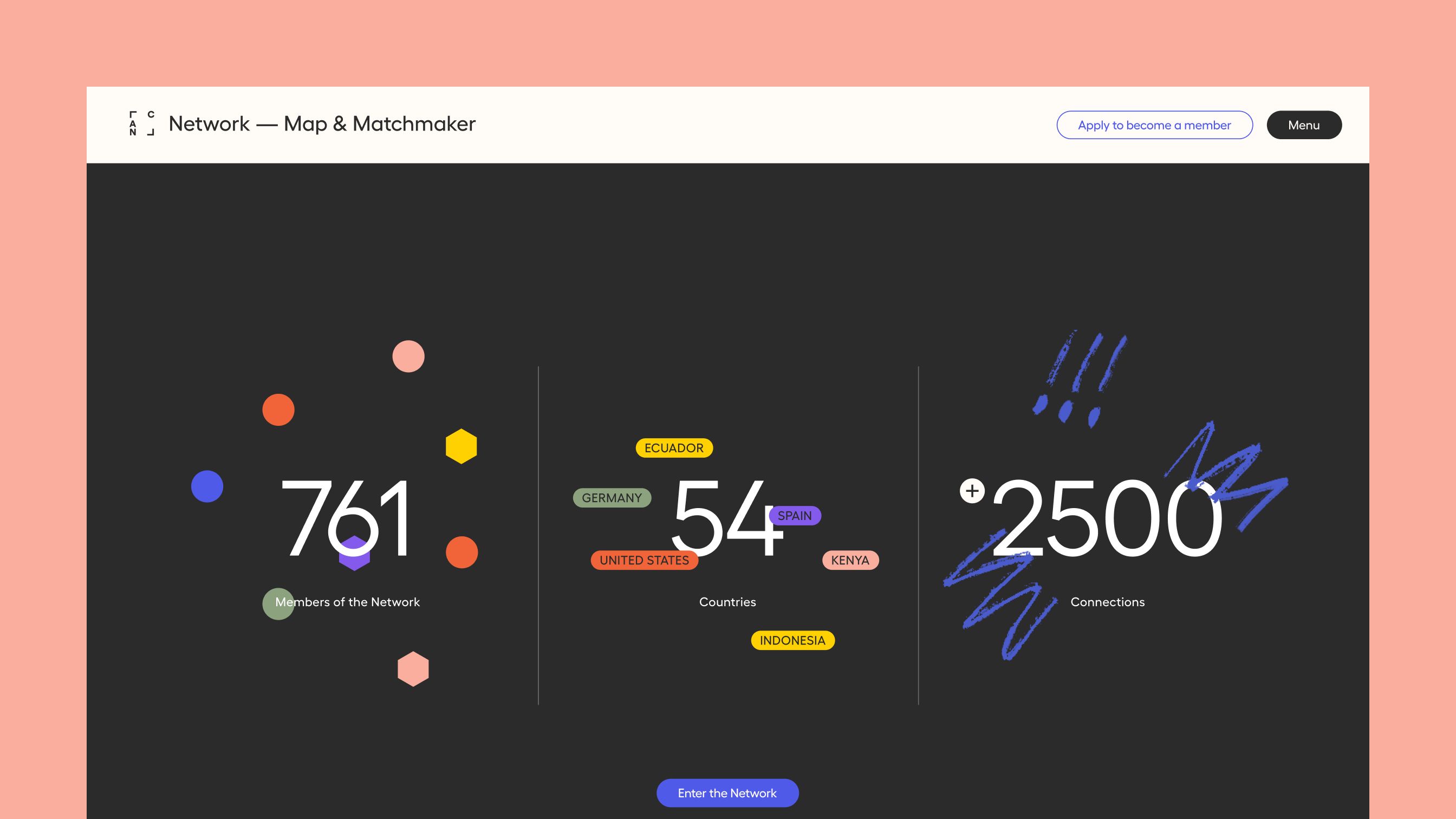
Loading screen for the network, with three numbers, members, countries and connections, dressed in colorful shapes and blue brush strokes, and an "Enter the Network" button.
The numbers load first, dressed in the same brush strokes and colors as the rest of the site, adding context to the experience while the network loads.

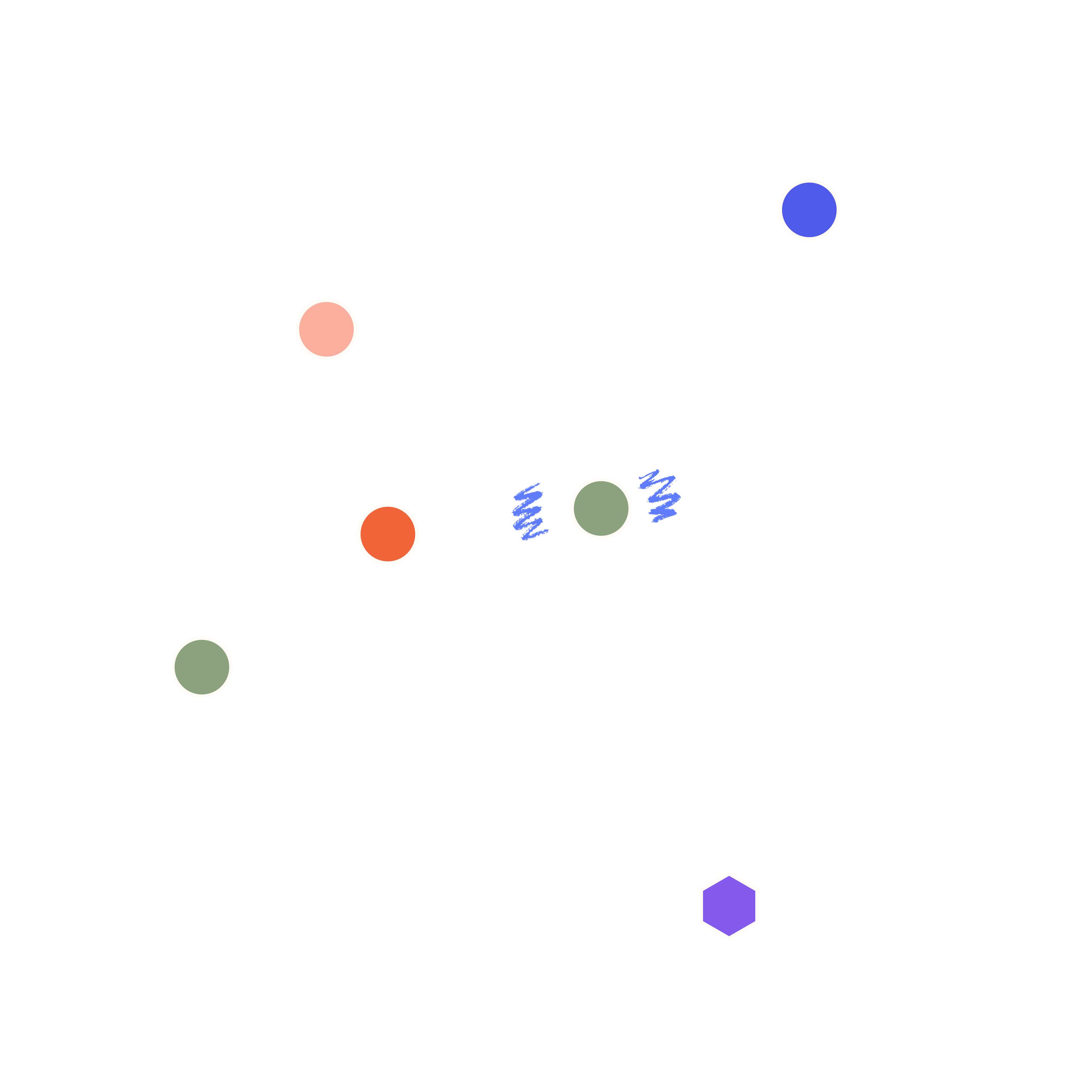
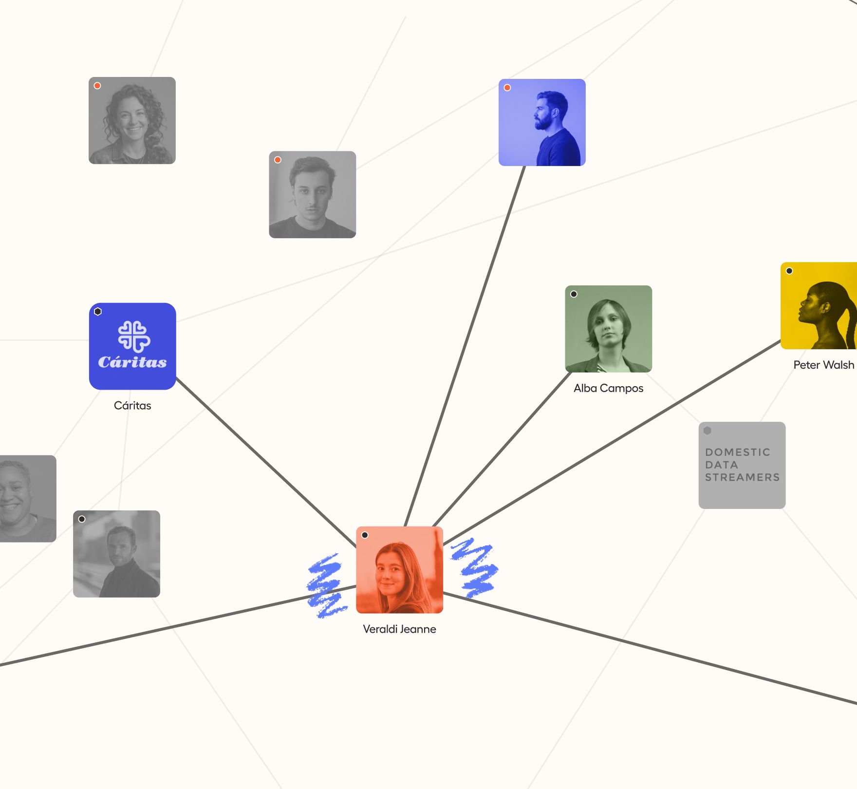
The network had to be easy to navigate at every zoom level, feel relatable and not cold, and keep the visual language of the rest of the site, all without losing usability. From afar, the community is a web of circles for individuals and hexagons for organisations. A link means resonance: one member's work resonates with another's, in either direction. As you zoom in, the dots turn into faces and logos tinted in the site's colors, so a network becomes a set of people. Hovering opens a profile, and search, filters and a list view keep it usable at any scale.
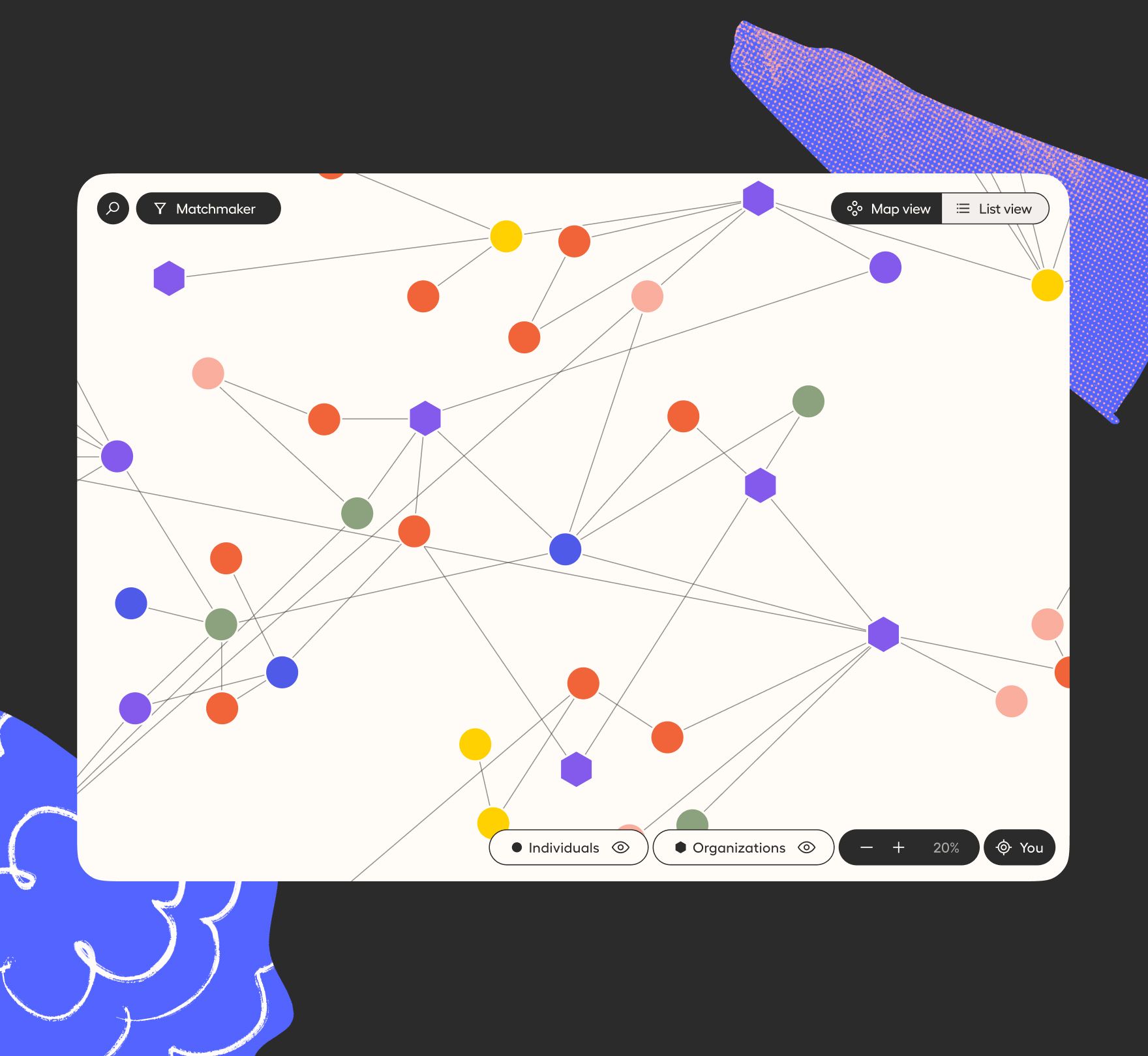
The network map zoomed out, showing circles for individuals and hexagons for organisations in different colors, connected by thin lines, with search, filters and a Map/List view switch.
A zoomed network view with most nodes in grayscale, except a highlighted member connected to Cáritas, Domestic Data Streamers and other colored nodes with names showing.

Even a technical graph speaks the language of the site: the entry screen mixes the graph's shapes with expressive brush strokes and the palette of the illustrations.

Art and social impact together

Every part of the site makes the same claim: art and social impact are one thing. The illustrations and the statements speak as one, and the network shows that the stand is not a lone one but a shared one.

Members can see who else is out there, find the work that resonates with their own and meet allies they would not have found alone.
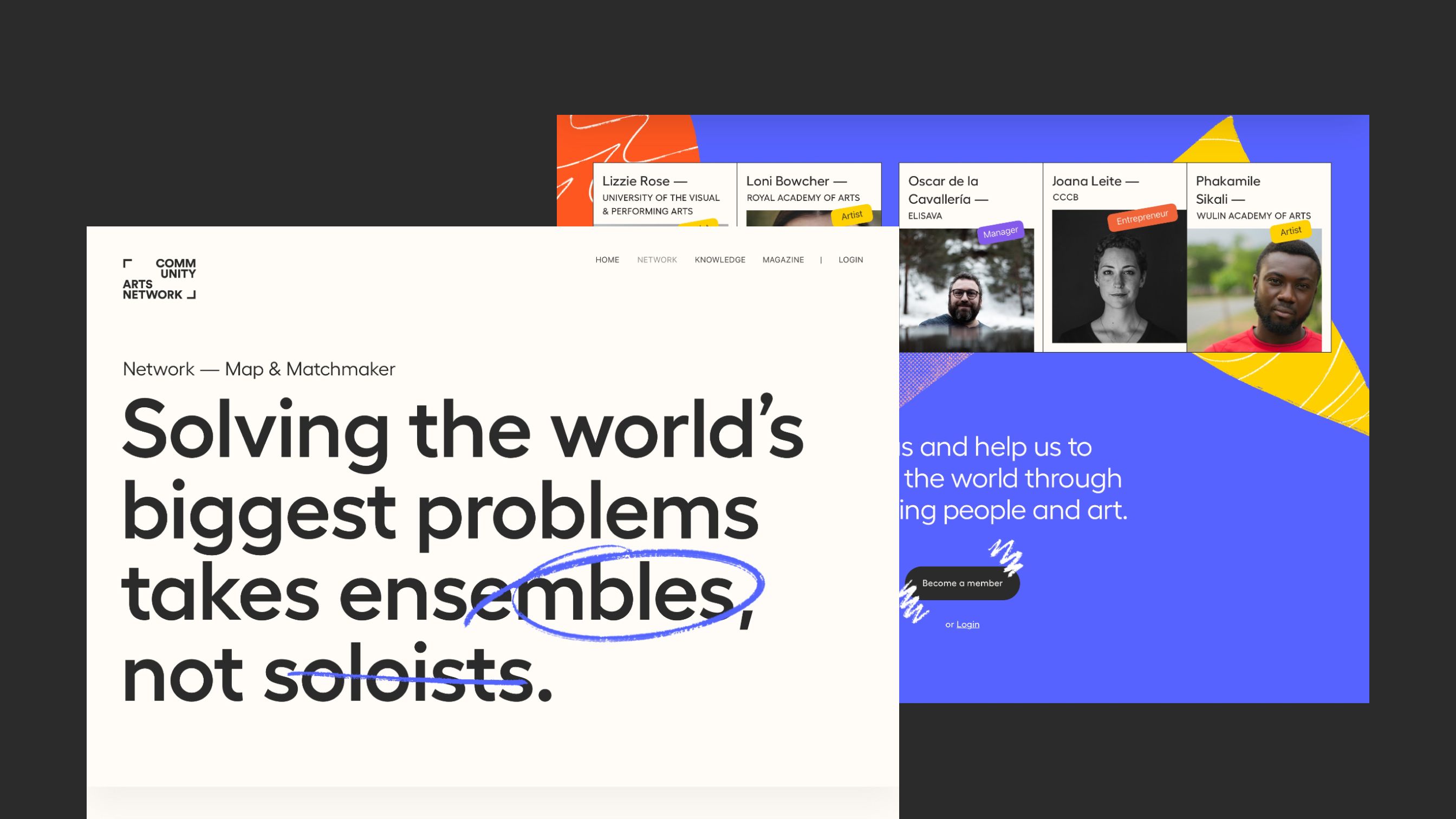
Closing screen with the line "Solving the world's biggest problems takes ensembles, not soloists", partly circled by hand, next to member cards and a purple panel inviting people to become a member.
Solving the world's biggest problems takes ensembles, not soloists: the site's own words for what CAN is built to do.

The Team

Domestic Data Streamers: Client side / Art Direction / Development


Ezequiel Salatino: Web design / UI - UX / Illustrations